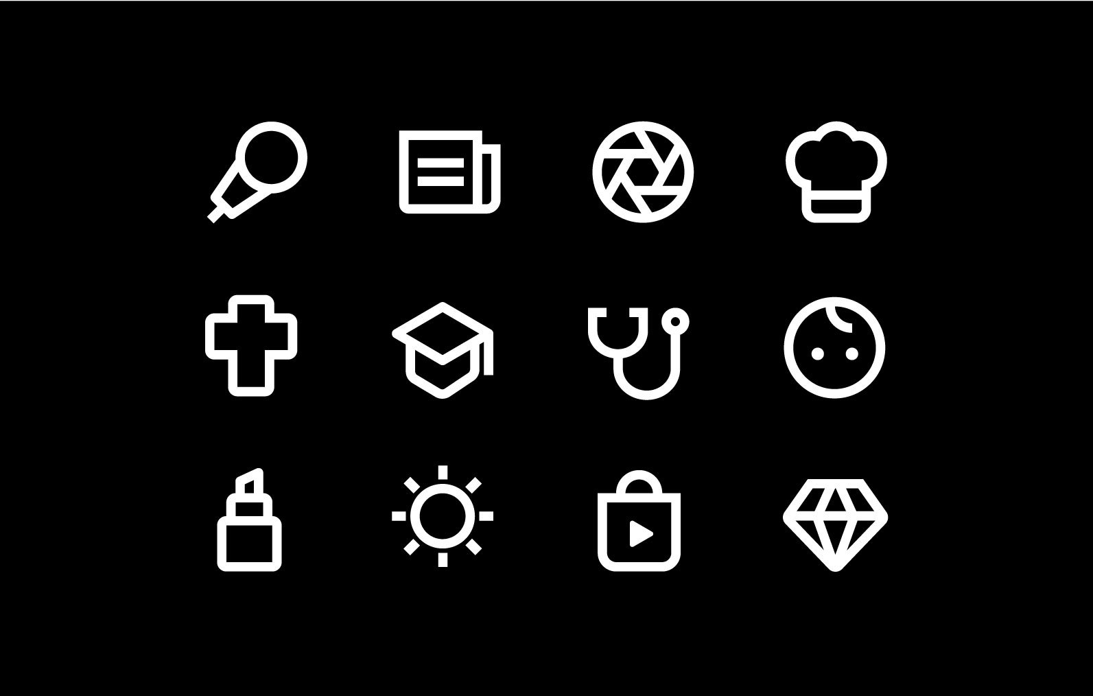
Icon Design
Created product icons for OndemandKorea’s revamped website and TV application and oversaw the upkeep of the icon library.
Situation
Most icons thaat are used throughout OnDemand Korea’s website have a general look which was missing the brand’s identity. Also, there was no consistency in style. Therefore, for this project, I took the initiative to explore and create new and original icons to emphasize OnDemandKorea’s brand.
New Icon Theme
Business Casual
We want to sound natural and less formal. Our conversations are real and our messages are delivered with confidence.Clear & Direct
Straight to the point. We write to be scanned first, then read in details later. We make it simple and precise.Considerate
By adding a slight round edges, we display a soft and friendly impression to the customers and communicate in truly audience comes first manner.Style Exploration
ODK Box Icons
ODK Box is a set-up box provided by OndemandKorea. I created icons for Benefit and Support pages, matching the visual style of the website by adding ODK Box’s brand colors; gray and bright green.
Onboarding Icons
I created a set of icons for the onboarding page for newly hired employees, which explains about company benefits and first day schedule. In collaboration with the motion designer, Andie Ortiz, we added motions to elevate the fun and excitement of the first day.


